Some details for my graduating class' thesis presentations has been settled! Friday December 14th, 2012 will be the day!
Watch this space: http://www.design-in-december.com/
Some details for my graduating class' thesis presentations has been settled! Friday December 14th, 2012 will be the day!
Watch this space: http://www.design-in-december.com/
[vimeo=http://vimeo.com/34488914]
I've been really wanting to share my own work for a while but it just wasn't quite ready... but here is a sneak peek. More information to come later.
Chanel is synonymous with timelessness. The brand’s coveted 2.55 bag (which is in fact its “date of birth”, February, 1955) continues to gain popularity for its classic design and longevity. Many people’s handbag collections have sprinklings of Chanel accessories from decades ago that never seem to age. Mademoiselle Chanel designed her accessories to be both practical and sensible. To her, the accessories signified true emblem of luxury and elegance. This remains true to this day with Karl Lagerfeld at the helm of the brand.
When Coco Chanel began to design the classic bag, she strove for functionality. For this reason, the bag showcases a double flap with has a zip-fastened pocket inside it, intended as a secret place for storing a love letter or blank notes. On the inside of the bag there are three bellow pockets, also meant to store a lady’s necessities like lipstick.
Coco also insisted that the bag had to have body, which is why we see the quilted diamond shaped pattern that adds volume to the shape. The garnet colored lining matches the color of the uniform she wore in the orphanage, while the double C is stitched like a coat of arms. The iconic rectangular clasp that is gilted with gold, the famous leather and chain shoulder strap had never been seen on a handbag before Coco Chanel added them.
This past summer, Whirlpool released a new range of kitchen appliances in a new premium exterior finish named "White Ice", sparking articles/commentary asking if Stainless Steel has been replaced by sleek new alternatives.


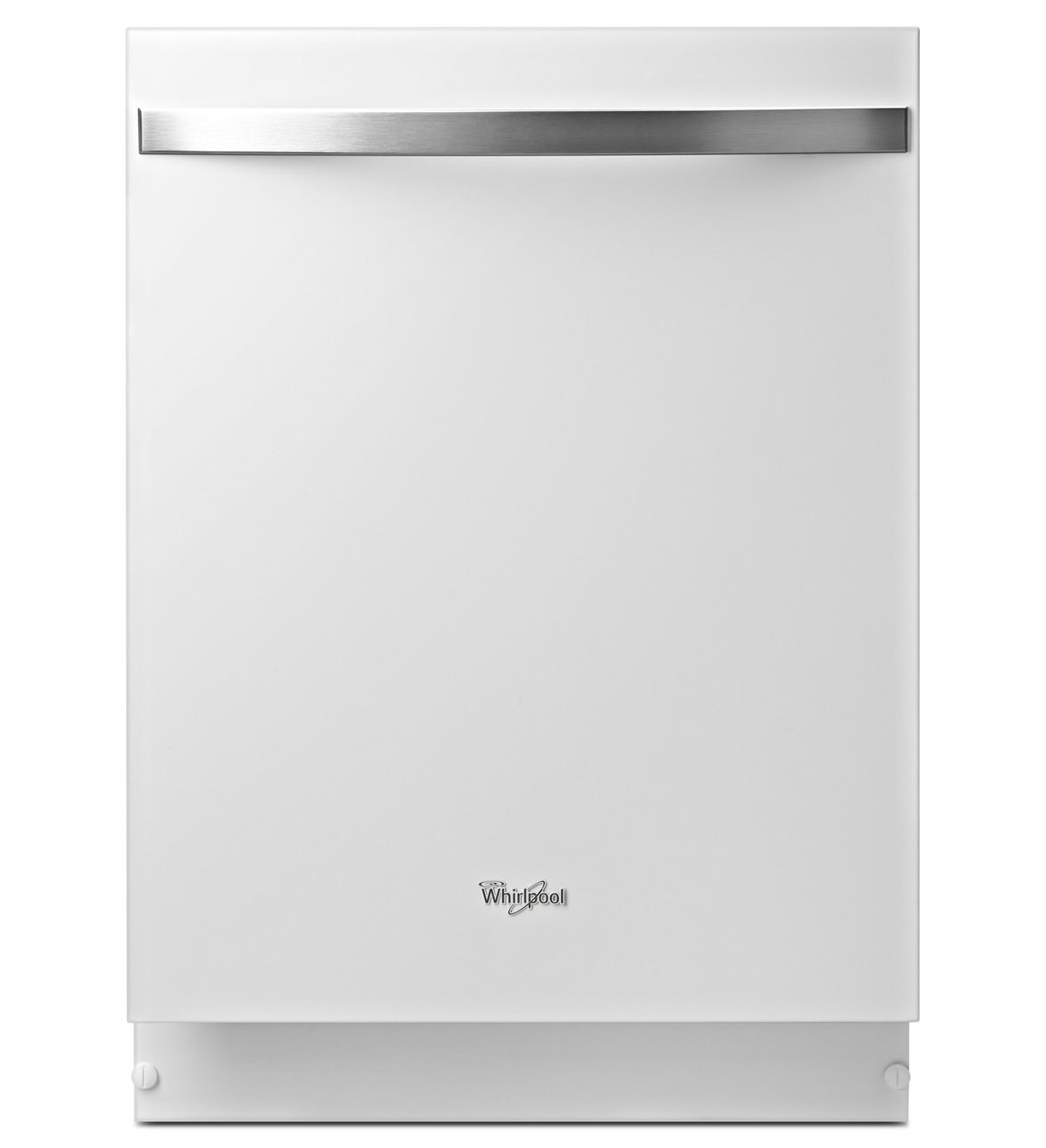
These appliances also come in "Black Ice", as well as the usual Stainless Steel.


On first glance I can not help but to wonder if Whirlpool is taking queues from iPhone 4; though departure from the long standing, monolithic, stainless steel finish is a welcome change in my opinion. However, I wonder if this will be a short-lived "fashionable" finish as white kitchen appliances are the norm for non-luxury rental apartments here in New York city. One really has to look very close in these photographs to see the shadows and reflections that give hints of depth especially around the Whirlpool logo, which is nonexistent on the Black Ice models. The photos make the black appliances look like they have a satin aluminum finish.
Refrigeratorinfo.com's article states Whirlpool's intentions:
Because the whole suite of appliances have such a unique style that’s exclusive to one manufacturer, it’s a safe bet that Whirlpool is hoping customers will upgrade their entire kitchen instead of taking a piecemeal approach.
Whirlpool seems to be aiming their new finish at customers who have grown weary of stainless and its numerous imitators. Indeed, the manufacturer says the new finish is “signifying a shift in the culture of home appliances.” Because it’s essentially an update of the classic white exterior, White Ice may appeal to consumers who are bored by stainless but also don’t want their kitchens to look dated. For Whirlpool, it’s an attempt to appeal to homeowners in a bottomed-out housing market, where renovating is less about increasing resale value and more about appealing to an individual’s own tastes.
Before the recession, investors looking to flip a house for profit wanted to install upscale finishes that could cheaply and easily update the look of a home. So from the HGTV-era onward, the most popular kitchens have combined granite countertops along with stainless steel appliances. Go to any home improvement store and you’ll be sure to see rows upon rows of fridges and dishwashers with stainless steel and stainless-style exteriors.
Interestingly it also goes onto say:
It wasn’t always that way, and all it takes is a look at classic sitcoms to see how far kitchens have come. If I Love Lucy were in color, the Ricardo’s kitchen likely would’ve had pastel finishes alongside white and stainless. Along with shows like Maude andSoap, the ’70s and early ’80s brought in earth tones, like avocado, harvest gold and almond. Later on, white and bisque became popular — even on the upscale appliances that Geoffrey tended to in The Fresh Prince of Bel-Air.
In addition to the modern White Ice, there are several other alternative finishes available on premium appliances. Smeg, an Italian company, builds retro-looking fridges that could easily be mistaken for your grandmother’s Norge. They’re available in a whole rainbow of shades, from bright yellow to deep purple. AGA, a British manufacturer, puts hard vitreous enamel surfaces in a variety of different colors on their ovens and dishwashers. Whirlpool’s own Amana division also introduced a series of colorful refrigerators in 2009, including an exterior called Green Tea which features a floral motif.
Refrigeratorpro.com points out that White Ice solves some of the problems that exists with stainless steel finishes.
[youtube:http://www.youtube.com/watch?v=fQVpSFoROg4] I came across this video today and was immediately intrigued because the poster frame for the movie showed what would have been a very shiny chrome bumper, and in true Jay Leno style, I thought he would introduce a car that I would not have known about because of its age.
Jonathan Ward, founder of Icon, is an expert in restoring old cars. In fact, Icon has a very successful restoring and updating process for Ford Broncos, and Toyota FJ and CJ cruisers. Mr Ward also has a "Derelict" line where the company reinvigorates vintage cars with modern chassis and creature comforts so that they could become versatile daily drivers... and yet be under the radar; a point he explains in the video... "... with two young sons and dog, surfboards and skateboards, I just always wanted to be a little more liberated and enjoy it." ... "this car is just liberating, I can take it down a dirt road, I can drift it sideways on Mulholland, I can park it anywhere, leave the windows down and no one screws with it." ... "better sense of history with this car... more smiles, less judgement. ... it's about the fun." "I love how counter intuitive it is, the way it looks and the way it feels." --- this is all about using the aesthetics of the car/materials to satisfy a set of intention in order to alter the perception of the people around you. I think it's brilliantly executed.
Also check out the wooden deck in the trunk! They talk about how the designers in the day must have been studying luxury rail cars and streamliners.
Here is another movie by eGarage. [vimeo:http://vimeo.com/35461693]
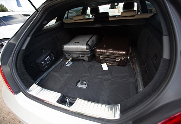
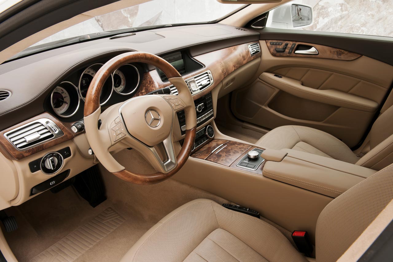
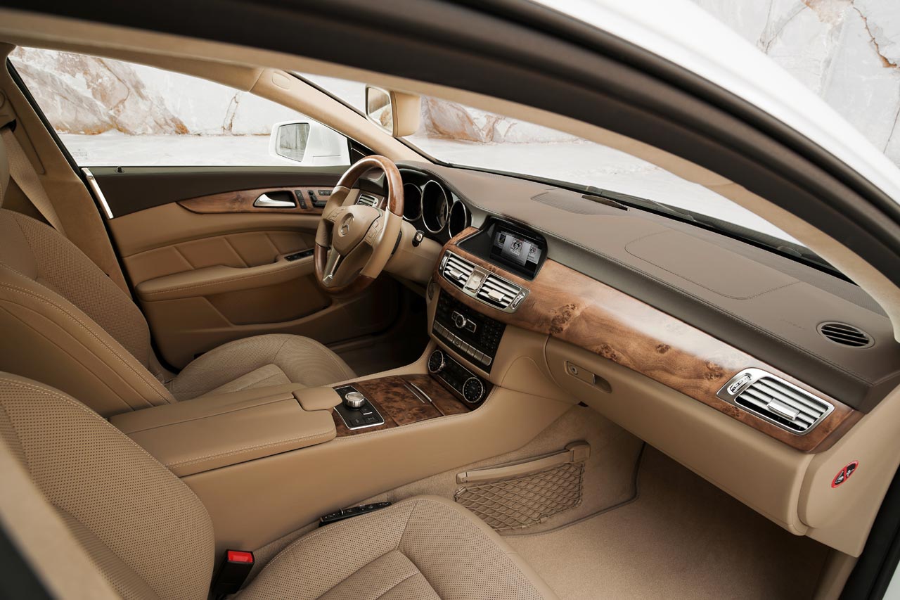
The use of wood in automobiles have evolved from structural in the early years to decorative. Now its use is standard in most cars to help soften the feel of the cars interior. Recently the Rolls Royce announced its 2012 Phantom Drophead Coupé would feature teak panelling in its trunk as well as its soft-top cover; inspired by classic racing yachts. This week, Mercedes Benz released their 2012 CLS Shooting Brake with a wooden trunk deck made of American cherry with inlaid smoked oak and aluminum rails.

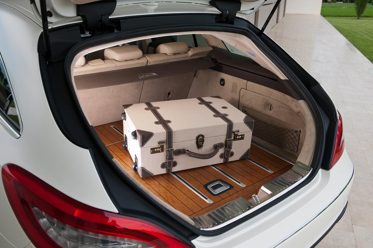
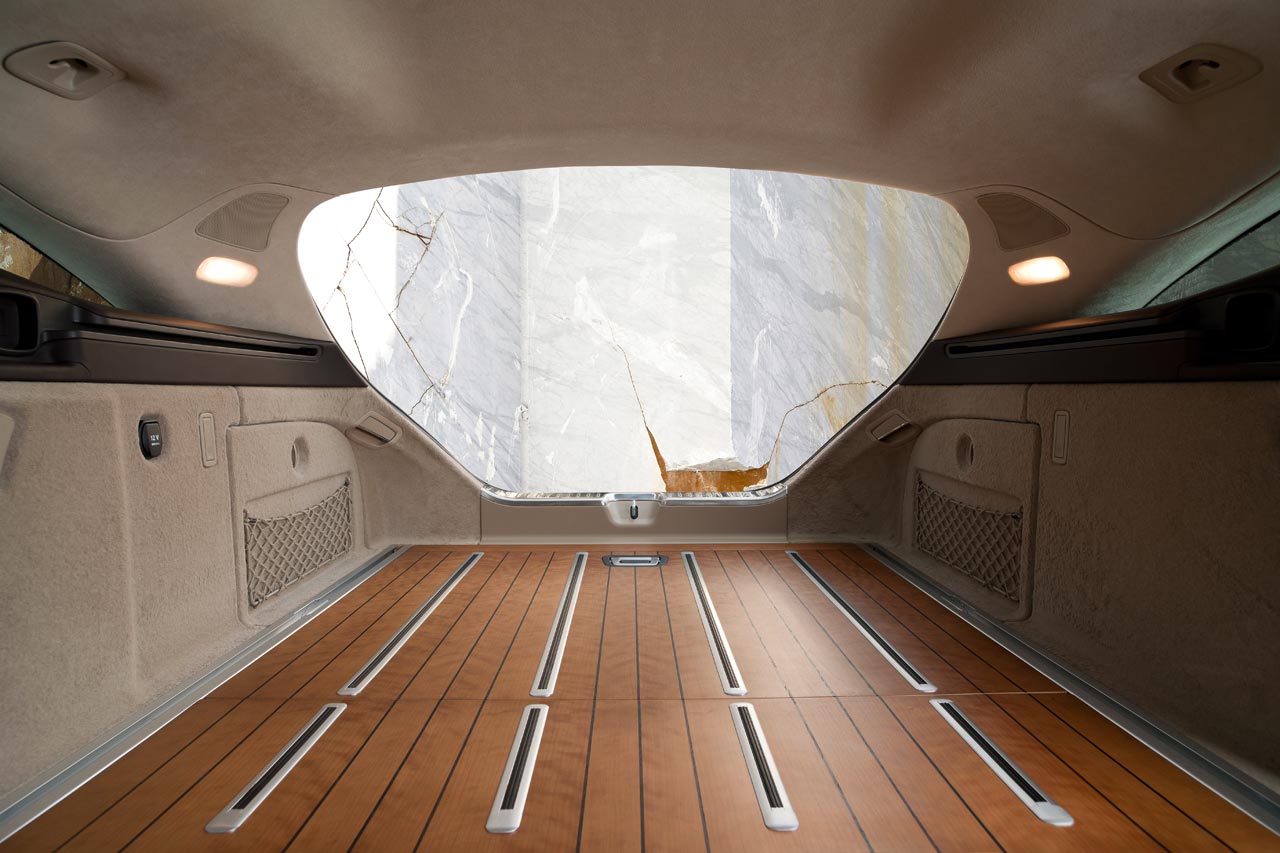

In case the owner would like to protect the wooden deck, there is an available non-slip mat.
